Wednesday, July 30, 2014

Using a Colour Wheel part 3 - Analogous Colours

Hi OTR friends, Fiona here again sharing with you another tutorial about using a colour wheel to help with deciding what colours to incorporate into your projects.

This time I'll explore "Analogous" colour schemes with you.

An Analogous colour scheme is any three colours side by side on the colour wheel. Usually one of the colours predominates.


In this case it's Green. You could also choose A Blue predominate colour and combine it with Blue Green on one side and Blue Violet on the other. If Oranges are your thing then you could choose Orange as your predominate colour and combine it with Red Orange and Yellow Orange and so on.


The beauty of Analogous colours is that you can choose colours that are similar or have the same base colour such as Green or you can choose a predominate colour that has two completely different colours either side such as this red example.


I've made a card using the Red, Red Violet and Red Orange combination.


I also tried out the Green, Yellow Green, Yellow combination on this card too.


Analogous colours are such a pretty way to combine three colours and will work beautifully on your layouts, in your journalling or as you've seen here, on your cards. Again I hope I've given you a little more knowledge about knowing and using a colour wheel. Next time I'll introduce you to "Monotone" colour schemes.

Until next time  xx   Fiona


Tuesday, July 29, 2014

Inspiration from Felicity for our July Challenge

Hello fellow OTR fans!
Felicity here today to hopefully inspire you.
 
I loved this months mood board.
 teal and shoes say no more!!! Tee hee


When I saw the mood board I saw a little sketch for the start of my inspiration.
Let me see if I can explain.
 
The back of the shoe was my photo placement and the heel was my cluster position, going down the page just as the heel.
Then the pop of red underneath meant I add a pop of red in my creation.
Sometimes when I look at pictures in magazines, pinterest and mood boards, I don't necessarily see the picture, I sometimes see sketch, as in this instance or a an embellishments.
I guess I look at mood boards with an open mind and outside the box.


I sit there with the picture and my notebook and pen and scribble down anything that comes to mind and then away I go creating.
 
I hope this gives you a little insight into my creativity brain!!
Tee hee
 
Till next time....
 
 Felicity XO

Monday, July 28, 2014

Designer Hot Spot


I would like to introduce to you a special guest to our blog Sue Schubert.

Sue was the winner of the Using Fabric Challenge back in June and the prize for winning that challenge was a Designer Hot Spot so we are going to share a little about Sue.

Q. Where do you Live?
A.  I live in Tamworth NSW

Q. What is something Quirky about you?
A. I hate the sun and heat, I avoid both at any cost, give me the night anytime!

Q. What is your most loved scrapping supply company
A. I don't have a favourite company, what ever I like I buy regardless of brand.

Q. Did you do any crafts before paper craft and what was it?
A. I have done many different types of crafts, I have to be doing something with my hands I have  knitted, crochet, embroidered , quilted, sewn clothes, curtains a bit of everything! 

Q. A before and after photo - One of you layouts that you ever made to the last one you have just created for the Mood Board Challenge


Before
this was made 5 years ago, following the birth of my first little granddaughter 

After
Sue used our current mood board challenge to create this stunning layout


Thank you Sue for joining us on the blog.


If you would like to see more of Sue's work please visit her at
http://itsnotastoryitsmylife.blogspot.com.au/

Please dont forget to visit the about us section to find out how we have changed things around here
http://offtherailsscrapbooking.blogspot.com.au/p/about-us.html

Sunday, July 27, 2014

Black Gesso and Gelatos

Hello again!

Last night I did some experimenting with black gesso and gelatos in my art journal.

I've taken some step by step pics of the procedure to inspire you to play and try something perhaps a little different.

1. First I just applied a layer or two of black gesso to my background. The white lines appeared because there's already stuff on the other side of the page. I was going to give it another coat and make it completely black, but decided I like it the way it is.
2. Then I started drawing some circles with different coloured gelatos. 
3 & 4. I used a small paint brush and went over each circle with a little water to spread the colour and set it with my heat gun.

1. So in #1 in the set below, you can see what the page looked like after I'd added several different coloured circles. At this stage, I was just playing around really, and didn't have any set ending in mind.
2 & 3. I then decided to cut off some chunks of gelato and melt them on to the page for a splatter effect.
4. I liked that, so decided to blend 2 colours at once. 

1. Then, to create some different texture, I used my scalpel to spread the melted gelato around a bit.
2 & 3 & 4. More mixing and blending and melting colours together 😊

1. So, a little tip when melting the chunks of gelato: spray the gelato with a little water, then hold your heat gun up high above the page until the gelato starts to stick a little, otherwise it will just go shooting off your page! 
2. As it starts to melt you can bring your heat gun down closer to the page and use it to direct the melted gelato all over the place to create a splatter effect.
3. After I felt there were enough random splatters around the page, I used my scalpel to scrape and smear again.
4. And this is how we're looking now!

1 & 2. The page was feeling a bit chalky and gritty now, so I sealed it with some gloss gel.
3. It's a little tricky to see, but the brush strokes stay in the gel, giving some more texture to the page. Love me some texture!
4. I then used a white Pitt Big Brush Stampers Pen to draw some flowers. I tried a gel pen for some finer detail, and a chalk marker, but neither of those would work on the gel. 

1. You can see the butterfly I drew with the pen... Not quite enough, so I went over it later with the Pitt pen.
2. I then went over the white and added detail with a black marker (a Sharpie).

And here's the finished product! 


This was fun, just playing around with different techniques, which is what art journaling is all about for me. I probably won't add any words of wisdom or inspiration to this, as I like it how it is. Hope you've been inspired to try something a little different. Thanks for reading along

Catie xx

Saturday, July 26, 2014

Use up your Stash Vol.2 by Sanna

Hi there!! I really liked making these cards and using some older product on them. I therefore made another project using older products from my stash and combining them together with newer ones. 

This is what I used:

Remember the paper ribbons from back then? I am going to call these paper "ribbon" rolls that way, as I have totally forgotten how they where called. They came in sets of 6, I think. I have two sets at home and they have just been lying around since probably 2007. Time to do something about it and use them! I additionally printed two Insta photos, chose a piece of polka dot paper and a white paper bag for my starting point.


I first cut the upper part of the paper bag a little bit lopsided/not straight and glued it down onto the patterned paper. Next I took several various long strips of paper ribbon and alighned them over the paper bag. I then added some black ink splatters (Glimmer Glaze oil slick - my fave product) over the area and my background was done.


Then I took some Studio Calico stars (new collection) and added them across the page for additional decoration. I also outlined tthem and the patterned paper using a black pen.


Now all I needed/wanted to do was to add some embellishments here and there. I used golden sequins and black plastic chevron/arrows for decoration.


Then I went along and added the title. I used various (old and new) alphas for this purpose. I also tucked a huge tag into the envelope and wrote quite a lot journaling. It is all about summer, sunshine and my relationship to this season. Let me just note that I am definitely more a summer person than a winter one... that should give you an idea what the journaling is all about :). I like creating pages like this, where there is instead a selfie a random photo and the journaling is all about me and my feelings toward a certain matter. I keep a "me"-album, where I gather these kind of laoyuts. In the end it will be a kind of a photo diary, when it is all done - if it will ever be all finished ;-) ...

Here is what my finished layout looks like:

I kept the layout quite clean and simple and concentrated on the journaling. And I was able to use quite a few older products here again too! I hope you will get inspired to use your older product too :). Have fun!!!
xoxo, Sanna

Friday, July 25, 2014

Monica's Faux Clipboard Mini Album

Hi everyone! Monica here to share a "mini" tutorial with you all :) I love the look of the premade mini albums you can buy that look like little clipboards with the pages hanging down. Instead of buying the premade one, I came up with my own version! Read on to find out how I did it...

Faux Clipboard Mini Album
(Step 1) Gather your supplies:
-thick piece of chipboard
-transparency, clear or patterned
-paint + brush
-2 binder rings (I used 1.5", but 1" would work)
-corner rounder punch
-hole punch

(Step 2) Cut the sheet of chipboard to size. Mine is 7x8.5". You could also do 6x9" or a smaller version. I also wanted to note that a sheet of cardboard would work just fine if you do not have chipboard. I have done one before where I tore one side off to reveal the corrugated cardboard underneath, and it looked really neat!

(Step 3) Round the corners. I used the Corner Chomper, which goes through chipboard easily. If you do not have one, you could also just leave the corners square.

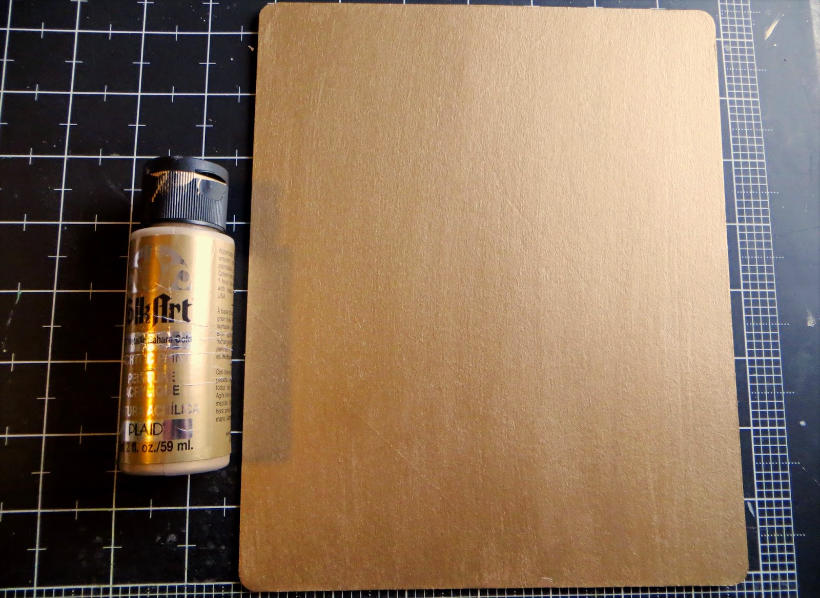
(Step 4) Paint the base of your mini book, both front & back. I used a slightly metallic bronze shade to resemble the wood of a clipboard (Metallic Sahara Gold by Plaid).

(Step 5) Punch holes for the binder clips. I did mine 1-1/4" down and 1-1/2" in on each side. I tried using the Crop-a-dile, but it didn't reach far enough. So I busted out my old Making Memories hole punch, which worked great! (I knew it would come in handy for something!)

(Step 6) Before beginning the inside pages, I made a cover out of a transparency to protect the inside pages and provide a sturdier cover. This, along with the inside pages, measure 6x7". I added my dimensional embellishments on the outside, to go along with the first page. I also sewed a bit along to bottom to add a little something extra.

(Step 7) Create your inside pages, and attach them to the base with binder rings. Ta da! A faux clipboard mini album.

(Stay tuned to see the rest of the inside pages on my blog: http://monicalifeasme.blogspot.com)

I hope you enjoyed this simple tutorial!

Thursday, July 24, 2014

Back to Basics

For my layout today I wanted to go back to basics of what scrap booking may have been a couple of years ago lol ( I can hear you laughing)
I have made a layout using white and one so white with pink and 1 flower only this was hard to limit myself with 1 flowers as I sometimes don't know when to stop. So I hope you enjoy the trip back into scrapbooking when we first started.
I have used lace and buttons and bows of ribbon,pearls and some jewels which all come from within my stash - So would love to see what you create if you like you can post to my blog

 What a sweet layout Gayle has created.

Dont forget to visit us on Facebook

Happy Creating

Wednesday, July 23, 2014

"Strawberry Malt" a LO by Lydia

Hi Everyone!  
Lydia here with a layout for you today.  

My boys love malts and shakes and this was the perfect photo to document that.  I've used a mix of Crate Paper lines on this page.  Just a fun, simple page to put together.


Thanks for stopping by the blog!  Make sure you check out all the other designer's inspiring projects and this month's color inspiration challenge.

Tuesday, July 22, 2014

Altered paint with flowers and pearls


Hi, Rose is here today to show us all her very beautiful project. Honestly can you imagine how gorgeous Rose's house looks with all the beautiful projects she makes ??


Hello everyone, I have used normal paint in this project with different flowers and roses including fern leaves and pearls.
 
The bottom of the brush has been sprayed with Ink, I have used a heat gun to dry it and get a shabby look then placed the lace and pearls around it and added the rest of flowers and charms. 


This is a close up of the brush and the details of the embellishments and charms on the top.


Different views of the brush ...!

 
I do hope that you do like what I have to share with you ..! 

Happy crafting 
Rose


Monday, July 21, 2014

Revamping a Layout

Hullo my friends! Lizzy with you today – to show you how I’ve ‘revamped’ a page that I created & never used for its original purpose. Plus a few hints on how you can use Faber-Castell gelatos to create a background.

Here’s my ‘before’ page.


And 'after':


 Initially, I did this:


Yeah, a bit radical. But necessary!!

CREATING A GELATO BACKGROUND

Take a sheet of plain card stock. Coat with gesso, or something similar. I used Matisse ‘Whte’ emulsion, which is similar. What you need is any product that will coat your paper, so when you slosh on a pile of water it won’t turn to mush. I used the white to tone down the colours as I worked with them – that’s the look I was aiming for.


Oh yeah - I keep my gesso in these bottles - easier to work with! Then I work out where my photo will go, mark it with pencil, so I don’t waste putting the color where it won’t be seen.
 Next step, choose your colours & simply squiggle them onto your paper.


Put lots on. Then with a water spray [an old mist bottle is the best], spray on a LOT of water. So much that it ‘pools’ on your page.


Next, using your finger, basically ‘finger paint’ it.


Once you’ve done this –working the colours in together a bit as well, add more water. Now tip your paper up & down so the colours ‘run’ together. If you want drips, now is the time to create these.


If there is too much water, simply add more Gelatos at this stage & work them in again. Once you’re happy with the ‘look’, you can leave it as is. Or do this extra step. VERY gently, gingerly almost, using some paper towel, blot the paper. This gives a bit more texture which I like, & softens & blends the colours even more.


That’s it! Let dry. I’m impatient, so I use my old hair dryer to dry my page.


If you find it has curled up, then simply coat the back side with gesso or paint – any wet medium will do. Once it dries, your whole page will be flat. This tip comes from Zeneva Kovic…..& it’s a fabulous one!

So, now I’ve got my paper & the bits from the original page I wanted to add, plus some extras…& I set about making it look decent. Some of the silver doily went under the edges, softened with gesso. I re-jigged the title & added a heart punched from the original paper - stamped, then also gessoed:


This page was for a challenge ‘One Little Word’ in June, where you had to use the word ‘will’…so I stamped that on the background…crookedly, but that was OK…I just made it more crooked ‘til it looked OK!  Here's a few more closies:


Hope this tutorial helps you in some small way. For me, best of all, I ‘rescued’ my page & now I’m happy with it!
Happy scrapping ~ Lizzy ♥♥♥