Showing posts with label photos. Show all posts

Sunday, May 13, 2018

Scrapbook layout tutorial from Pinterest by Julie

Good morning Off The Rails fans

Today I want to share a tutorial with you that was inspired by a picture I saw on Pinterest.

I must admit it took a bit of doing because it entails cutting up a photo and I was worried that I might ruin it.

The layout is very simple and yet I just love how it turned out.

The photo was 7 1/2" tall x 7" wide


I have used an embossed metallic paper, a glitter patterned paper and 2 sheets of black cardstock. For an embellishment I am re-puposing an old necklace.


I have cut my photo at 2" and 5" giving me 2 pieces at 2" wide and one (centre) piece 3" wide.

I could have cut it into even sized pieces but I didn't like where the cut fell in relation to Cindy's face.


Cut photo mats from black cardstock. 2 pieces at 2 1/4" x 7 3/4" and one at 3 1/4" by 7 3/4"


Attach the photos to the mats


Cut the silver embossed paper to 11 1/2" by 11 1/2" and attach it to a 12" by 12" piece of black cardstock.


Cut the patterned paper to 2 1/2" by 11 1/2" and attach to the layout 3" up from the bottom


Using your hot glue gun attach a piece of cardboard to the centre piece of your photo.


Attach your photo to the layout as show in the photo below, staggering the tops of the photo and slightly overlapping the bottom.

Attach the embellishment using the hot glue gun


Add your title and journalling and your layout is finished.


I would love to see your take on this layout, so if you are brave enough to cut up a photo, and lets face it you can always get it re-printed, please share it with us here at Off The Rails Scrapbooking.

Cheers
Julie

Wednesday, December 16, 2015

We say goodbye to Heather McMahon

Hello - it's Heather McMahon here with my last Off The Rails post. I have enjoyed my time here and I'd like to thank Amanda Sousa so much for having me in her team.
Today I want to show you how you can use up leftover sprays. Firstly, here's my layout:


This is my niece's gorgeous kitten, Billie, who has since turned into an equally gorgeous cat. Any kitten that happily spends Christmas Day wearing tinsel has to have character!


Here's how I used my leftover spray.....


Whenever you spray through a stencil, keep a sheet of white (or coordinating coloured) cardstock nearby. After spraying, flip the stencil over and stamp it onto the cardstock. I have only used one colour and stencil here but you can use multiple colours and multiple stencils on the one cardstock for easy and unique backgrounds.

Here's how I then created my layout.....
Sponge pink and blue ink through a Dusty Attic stencil.


Paint the chippie pieces.


Mount chippies, paper and photos onto the page.


Tuck some gauze behind the photo, add a tag and thread and the first part of the title.


Add a strip of paper at the top and glue a line of beads underneath. Glue scattered beads in place. Add the chippie title, a butterfly and sequins for a bit more Christmas bling. Don't forget to add your journalling!


Here are some closeups.....


Here's the stunning mood board that I used for this project. I love that it's Christmassy without using traditional Christmas colours. I hope you can join in this month!


Thank you for sharing this journey with me. Wishing you all the very best for Christmas and for a safe and happy 2016.


Happy scrappin'!


Heather McMahon

Wednesday, August 20, 2014

Noticing Things Around You

Today on the blog we have the very clever Lynn who has created a tutorial that will make you view things in another way.


As we were flying down the road on the way to the keys, I happened to notice these banners cleverly leading your eye back to the advertising sign. (I apologize for the photo because did I have the presence of mind to capture it on the sunny day we were on our way down? Nooooooo....I captured it on the return trip - where it poured down rain the entire time. Anyhoo, my scrappy minions, I had an AHA moment, fleeting though they are, and I quickly thought it would be cool to have a banner used in that same clever way by associating it with a title or journaling box and draw my reader's eye straight to it.

I grabbed my little notebook and did a quick sketch with some notations. What? You don't carry around a notebook? Well I didn't either, so when we stopped to pick up some supplies, I purchased an inexpensive notebook and I will carry that baby around with me hence forward. 


It will be earning its keep by keeping notes, lists, and cute things I'll never remember, although I have high hopes, and catching all those things around me that could possible provide another AHA moment and get more cool and interesting things on my scrapbook page.

I made a second sketch when I discovered the photos I had in mind had a different orientation than what the first impromptu sketch. And isn't that versatile.


 I laid out my photos according the sketch and began to add in the embellishments and layers. The base paper is from Studio Calico and has those cool words already written on them so I tried to place the pictures where I could keep the words as accents. I decided to make the banner out of vellum because the photos took more space than what I drew on the sketch and needed to overlay it on the photos.


 I got rid of the knot because it was making me crazy and I hand cut the banners. On the final version I had to make the banners smaller because it just got way too wild with the bigger size. I also changed them up and made triangles with the banners.


I like how it actually does take you eye right up to the title. You could also use the banners to highlight your journaling or that special photo. You know of course being sketch professionals that you are, that its just a guide and you can change it up to suit your fancy. 


In full disclosure, I don't normally draw my own sketches (as you can see from the awesome talent going on), so this whole process was new to me, mostly because I was tasked as a DT member to provide a tutorial for you, and I, in turn, learned something as well.

Thanks for tuning in, and your challenge, if you choose to accept, is to look about your surroundings and see things that can be incorporated into your scrapbook pages, and use either a notebook, napkin or receipt that you might have handy in order to make note of your awesome find.

Then make an awesome page and share!

Monday, August 18, 2014

July's Memory Planner from Felicity

                   
Its time for another instalment with my memory Planner.
It was birthday month for us, so lots of birthday photos!


I added in a flap so I could add a few more birthday photos.


Just another flap too on the other side of the plastic sleeve.


Saturday, July 19, 2014

July's Planner Instalment


Hello :)
Its time for another Monthly Planner instalment.
I just love my planner and so do my little boys.
Flicking through the photos and then chatting about what we did back then.
Its sure is a great way to document your day to day life.
 
I created a few little flaps again with the help of my sewing machine.
Have I told you how much I love sewing on my projects :)


Last month on Instagram I played along with Maggie Massy 30 days of happy.
I couldn't include all the photos, but I did collage a few of  favourites.
 
 
Hope I have inspired you do document those little things in life that make up the big picture :)
 
Felicity XO

Sunday, July 13, 2014

How To Highlight A Section Of Your Photograph

HOW TO HIGHLIGHT A SECTION OF YOUR PHOTOGRAPH

The photo on my DT layout this month is mainly black and white, except for one coloured section that I wanted to highlight. I used a mainly B&W photo because I didn’t want to detract from the lovely colours in the challenge colour palette but, on the other hand, I didn’t want to lose the detail in my photo. Here’s how I overcame the challenge digitally. I’ve used my Artisan programme to do this but you can use any digital software to create the same effect.

Step 1: Isolating the area you want to stand out


After loading my photo, I used the “Cut & Fill” tool (highlighted in yellow) then “Shapes” (also highlighted) and from the drop down box I chose the circle shape. I moved the circle over the part of the photo I wanted to highlight. When the circle was in place as shown above, I chose to “Keep both sections” (i.e. the highlighted circle and the background) and checked “copy”.


This is what you’ll end up with 1 the original photo and 2 both parts of the copy (the circle cut out and the background). At this stage, nothing looks any different because all the layers are on top of each other.

Step 2: Highlighting the area

You can see now that I have deleted the background copy and I’m left with the original photo and the circle. All that has to be done now is to click on the original photo and convert it to B&W by using the “Color” “Black and White” tools which are highlighted in yellow above. The circle remains in colour. You can now make it stand out even more by adding shadows or other affects to the circle. I used a frame on my layout to highlight the circle.


The traditional solution
If you want to use this technique on a traditional layout, it’s very easy. First, print two copies of your photo in the same size, one coloured and one B&W. Select the area you want to highlight on the coloured photo and cut it out. Now you can stick the coloured cut-out on top of the B&W photo. You can make the cut-out standout even more by sticking it down with foam dots.
Although I’ve used a circle cut-out in this example, you can use any shape you want for this technique. Here’s another layout I did recently using the technique but with a very different outcome.


Thank you for stopping by and I hope this inspires you to try something new.
Cheers.

Facebook is the place to find out about exciting news and sneek peeks

Sunday, July 6, 2014

Lynn's Layout


What do you put on your creations? Do you find everyday items that you know would suit the vision in your head? Well Lynn has done exactly that.


She has used a straw on the side of her photo that not only draws attention to it but the gorgeous photo that she has used. Lynn chose to use the colours of our current challenge to create this stunning mixed media layout


Happy Creating

Wednesday, June 25, 2014

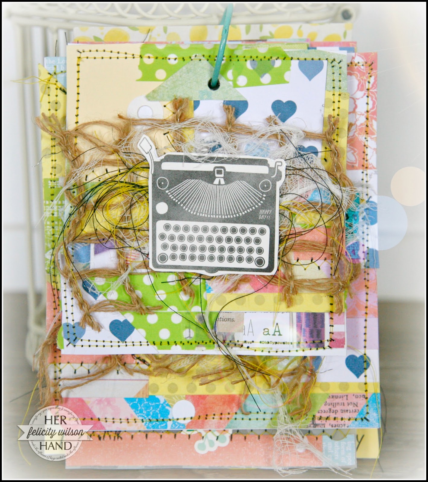
Felicity's Mini Album

We promised that we would share with you Felicity's mini album and here it is
 
You know when you try something new. But at first you stand back, bit uncertain. So you dip your toes in, it feels not bad, go a deep deeper and suddenly your submersed and loving it?
That was a bit like me with this mini album. I have always loved looking at mini's, admiring them wishing I could pull something off that good.
So I finally start with just my toes and before I knew it, I had finished this mini and totally in love with it! 

To make my cover I simply used scraps of the paper from the APOCD cupcake kit and stitched it together. Quiet therapeutic actually!


I added some journaling on vellum to create a bit of space to rest the eye . I also left some of my threads from the machine stitching hanging and added others in that were on my desk, for a bit of texture. Kind of fun!


I didn't add journaling to the photos or much at all really, because I think the photos alone tell the story.


Products: APOCD cupcake kit
  
Hope this inspires you today.
Felicity XO