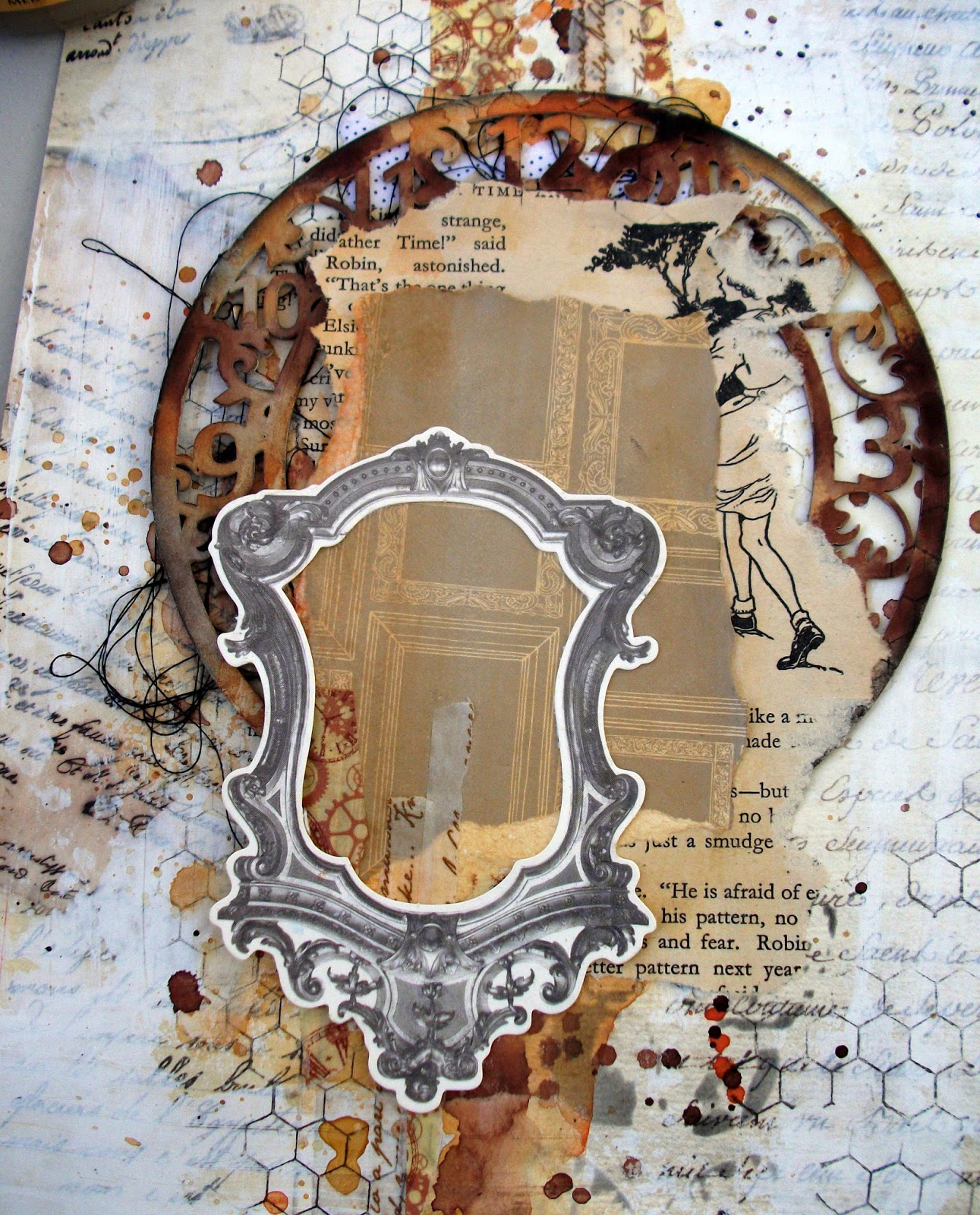
I started this page by wiping some white gesso over the whole page using an old rewards card. I wanted to dull it down slightly and give it an aged look.
Then I added some water colour paints in the coordinating colours of the colour palette.
Imaginarium are our sponsors this month and so I wanted to show case some of their amazing chippies. This is a clock face that I just love and I thought it would suit my layout really well.
I coated it with gesso and gave it a good covering of water colour paint too.
Then I did some stamping with my chicken wire stamp to represent the same pattern as on the sketch. I didn't want to do too much stamping, just this pattern. That's why I chose the background paper with hand writing on it. I thought that would represent the writing on the sketch really well.
I also blended some balck ink through a stencil over some adorable butterfly's. I was really happy with the combined result.
So then I went and covered it all up with some scraps of book paper LOL It has taken me ages to be able to do this type of scrapping. I always thought it was such a waste covering everything up but now I can see how it adds to the end result and I'm much more comfortable doing it now.
on top of the paper scraps I added my chipboard clock all painted up with water colour paints. I also edged it ever so lightly with the black ink to help it pop!
Then I covered it all up again LOL!
I added some more layers like a paper doily, a brown Kraft tag and a velvet leaf but you could add anything you liked to give it height and layers.
I rubbed a butterfly in the top right hand corner and added a little quote to capture the meaning behind the page.
Finally I added some 3D embellishments. This one I created from a little Tim Holtz piece. I wanted to represent the little girl on the sketch wearing the fairy wings. I cut out the butterfly from some Kaisercraft paper I had and glued the doll onto it, making the perfect embellishment for the layout!
I created this one while camping with my hubby and his parents. I like to call it "Scramping" This was my studio! Pretty neat hu?
And this was my inspiration. Sunshine and lots of nature.
This is a beautiful little spot in Victoria, just over our South Australian boarder that we like to visit. it makes for a great weekend away.
And look, even this little fellow paid us a visit!
Well I hope you've enjoyed my post and I've given you some inspiration to give our challenge a go :)
Catch you soon
Fiona xx


Stunning!!!! Thanks for sharing!!!! I really like this page!!
ReplyDeleteLove your write up. This is an awesome layout. Love the layers. I with your about creating the perfect background then covering it up. But it works and it's beautiful.
ReplyDeleteJust fabulous Fiona!!! LOVE where you created too! <3
ReplyDeleteSuch a gorgeous page Fiona! Loving the little tutorial and your style of writing. You also taken me by surprise with your great scramping photos which I thought was done indoor. I can imagine the wonderful time you had surrounding by nature. Very inspirational! Thank you for sharing! Hugs xx
ReplyDeleteBeautiful layout Fiona and thanks for sharing the scramping shots :)
ReplyDelete