Hi everyone.. Bev
here today.
I am excited today to share a page for Off the Rails
Scrapbooking using my design team products from The Rubber Buggy - the
fabulous Blue Fern Studios paper collection and also a fun challenge
from Challenge Yourself. When making this page I realized I was doing so
many fun but easy things to create it and I thought it would be awesome
to share the details with you today.
Supply List:
Paper: Blue Fern Studios Vintage Christmas
Ink: Tim Holtz ranger
Other: stardreams cardstock, cardstock misc., stickers, royal coat glossy accents, modeling paste smooched
Sketch/ challege yourself #24
Paper: Blue Fern Studios Vintage Christmas
Ink: Tim Holtz ranger
Other: stardreams cardstock, cardstock misc., stickers, royal coat glossy accents, modeling paste smooched
Sketch/ challege yourself #24
Here is the sketch I used:
So now we are ready to start. The papers being used have awesome print
sections and you must decide how and where the photo is going to fit and
not cover the amazing paper. With the sketch and paper and the pattern
on the paper my plan was to locate the main cluster to the lower centre
following the sketch. The upper band from the sketch is awesome but I
didn't want to cover the right side of the paper.
What is did was to start with the strip of striped paper. I ran it
across the top but when I got to the floral section you slit the paper
and slide the piece behind. I then fussy cut the flower and part of the
label from another section of accent papers and placed it to the top
left side of the upper border.
Now following the main clustered section for the photo I decided the
placement of an additional background piece for matting with just a
slightly darker colouring than the main paper. I cut the strips of
accent colours and placed them on the mat. Now playing around with it I
decided the best placement would be covering the amazing pattern in the
left lower section.. so this is where you fussy cut around the print
image from top to bottom allowing the new section to be dropped
partially behind but central on the overall page and creating a fabulous
layered mat and accents ready for the photo without loosing the
fabulous floral section.
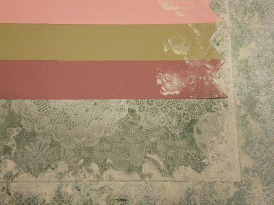
Now you would see the paper colouring difference popping just a bit too
much for eye appeal so getting out the modeling paste and a plastic bag
we are going to smooch around the edges to blend the 2 layers together.
Here are to shots of the smooching up close.
Another fun tip today is to create your very own thicker looking titles.
I cricut cut the title Merry Christmas and then applies glossy accents
which you let dry to a glossy puffy looking title.
Here is the close up view... now you can make all your very own titles in any colour and style you like.
Thanks for joining me today... I enjoyed sharing the process used to
create my Christmas page.. along with the fun easy tips that you can use
to create when making your pages too.
Merry Christmas and Happy New Years to all.


this is a lovely page, thanks for sharing such great tips!! Some of this would never have occurred to me!
ReplyDeletethis is a lovely page, thanks for sharing such great tips!! Some of this would never have occurred to me!
ReplyDeleteBeautiful Bev! xoxo
ReplyDeleteGreat page Bev ... as always!
ReplyDelete